7 steps for a perfect mood board
We all love a good mood board and we can all have different ways of doing it.
Presentation is key in our day to day projects and all the hard work is nothing without a proper pamper treat for your client. A great way to sell the project and to make your client visualise the design project is using the mood boards. Nowadays it’s all about the 3D projects, its apps, gadgets and how to make a realising image that can present what you plan to do, and let’s face it … it’s kind of cool to be able to present your ideas in that way and …safe. If you know what I mean!
But what is happing with the feel of textures, what is happening with the other senses that we need to satisfy? We agreed that the visual is covered by the 3d renders or by beautiful hand drawings that offer such a personal touch to the project.
This is where the mood boards step in. This is the perfect way to say to your client: ‘This is how it feels, this is the way that the furniture handles look like’. And you know that feelings sell… feelings sell because even thaw you can’t touch them they are real. This way you give a hit of reality and a feeling at the same time.
This are 10 steps in getting our mood board ready:
1:
Step one is to establish what the colour that will dominate the space is. This are in most cases this will be determined by the walls. This will be your background or at least will cover a good percentage of the mood board.
2:
On the set background you can now add elements that will cover a larger area of your space, like the curtains, rugs and sofas. If the sofa is sitting in front of the window you can cut a larger piece of curtain and place it at the back of the sofa textile. This way you now have a 3 layer colour and patterns, same as in you final project.
3:
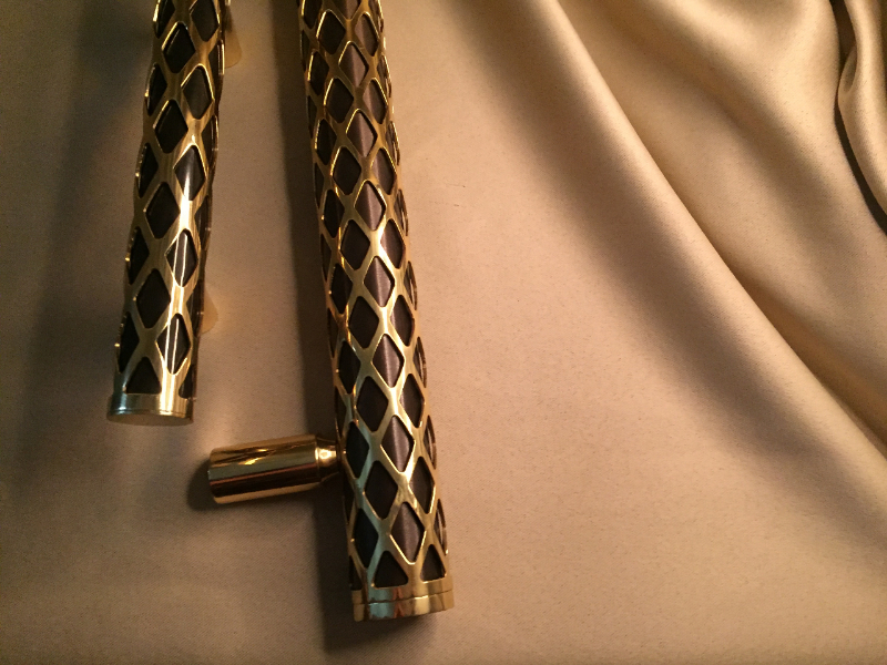
Metal inserts are becoming more and more popular. You can use brass, bronze and stainless steel finishes lighting, in furniture frames, coffee table and most important in luxury furniture handles. If you find it difficult to find luxury furniture at affordable prices I strongly recommend you to have a look at this guys: Unum Design they are absolutely wonderful.
Metal inserts are easy to attach in the mood board and they will add value and shine to your mood board. You can use a small door knob or a feature handle to add more value to the set.
4:
Step 4 is adding your other accents like finishes or colours that will be found in your accessories. They need to be just small references, as we don’t want to have our eyes focusing in this elements. They are here just to blend in all other major colours and textures. Don’t exaggerate and try to keep this as clean as possible. Nobody understands a hectic board.
5:
Try to add a real element in this by showing the 3d image with the space, even if this means a rough hand drawing. Use watercolours to hi-light the areas that you find of more interest without focusing on all details.
Remember: the role of the mood board is to offer a feeling of what the space will look like.
6:
Enjoy doing it! Don’t forget that this is one of those things in which you need to add passion. You want to transmit a certain emotion. Don’t even think about starting if you have a bad day or if you are not in a creative state of mind.
7:
Add one surprise element. You want to give a wow factor and to show that you went over your head to create this. This can be a personal touch, for example you can add a gem stone that will have a similar look with a decorative object or you can use natural elements like a little leaf or a flower that they can use as a add on. Nothing major… but something good enough for them to notice.
The entire design process is a very personal one and everybody has his own personal ways of doing this. There are many ways of presenting your designer work but the main idea is to give a certain feeling to the space, to give excitement and mood boards offer this.
Have fun and enjoy playing with colours and texture!

